Major project: Use of colour
Color is a potent instrument for communication and a global language. The most important and significant component of any visual design is color. Psychologists and marketers have shown via their research how color affects our feelings and perceptions. Color schemes are frequently utilized to draw the viewer's attention to specific elements of a design or to elicit a desired feeling in them. Color is carefully chosen by designers to produce balance, harmony, and coherence. (goldrabbit.co.uk, 2023)
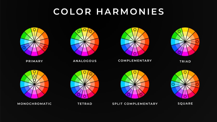
On the basic level, colour wheel can be split into these categories (according to Manchester Digital) :
Complementary colours
These are opposite on the colour wheel. Orange and blue are opposite on the wheel and therefore are complementary colours!
Tertiary colours
Tertiary colours are created from mixing both primary and secondary colours together. These are the colours that fill up the rest of our colour wheel."
goldrabbit.co.uk. (n.d.). The Importance of Colour in Graphic Design - Gold Rabbit Ltd. [online] Available at: https://goldrabbit.co.uk/the-importance-of-colour-in-graphic-design/.
Manchester Digital. (n.d.). Why is colour theory important? A guide to powerful graphic design. [online] Available at: https://www.manchesterdigital.com/post/design-cloud/why-is-colour-theory-important-a-guide-to-powerful-graphic-design.
image from manchesterdigital.com
It is important to learn the rules of colours not only as a graphic designer but as an artist in general in order to understand the concept of the usage of colourin any design as a whole. That's why colour wheels were invented - to help designers navigate and be conciderate about using colour in their work.
image from goldrabbit.co.uk
"Primary colours
Red, Yellow and Blue make up the Primary Colours and can be mixed to create every other colour that exists.Secondary colours
Orange, Green and Purple are our secondary colours! Secondary colours are created by mixing two primary colours together.
Orange, Green and Purple are our secondary colours! Secondary colours are created by mixing two primary colours together.
Complementary colours
These are opposite on the colour wheel. Orange and blue are opposite on the wheel and therefore are complementary colours!
Tertiary colours
Tertiary colours are created from mixing both primary and secondary colours together. These are the colours that fill up the rest of our colour wheel."
References:
goldrabbit.co.uk. (n.d.). The Importance of Colour in Graphic Design - Gold Rabbit Ltd. [online] Available at: https://goldrabbit.co.uk/the-importance-of-colour-in-graphic-design/.
Manchester Digital. (n.d.). Why is colour theory important? A guide to powerful graphic design. [online] Available at: https://www.manchesterdigital.com/post/design-cloud/why-is-colour-theory-important-a-guide-to-powerful-graphic-design.


Comments
Post a Comment